 Ultramarine. Cobalt. Indigo. Lapis. Sapphire. Navy. The list of names for blue is nearly endless. Across gender and ethnicity, blue is most people’s favorite color. My heart was captured by the blue fire of arctic ice – a color so intense, so strange, it was difficult for me to believe it was real. That is the beginning of my love affair with arctic blue.
In October of last year when I strolled through the V&A’s new History of Photography exhibit I was drawn to the cyanotypes, blue made manifest in photography. I knew then I had to learn to make these amazing prints, so rich, so blue, and offering a wide scope of post-processing manipulation.
 The process is deceptively easy. You coat a sturdy paper with an equal mix of a solution of potassium ferricyanide and a solution of ferric ammonium citrate. Any heavy duty paper, fabric, or really, any surface that will absorb this chemical mixture will do.
The first cyanotypes were made of ferns placed directly on the paper and exposed to sunlight, a process we would call a photogram. Modern cyanotypes are made primarily from digital negatives, exposed to UV light and contact-printed onto paper. Then the print is washed in a water bath to remove the unexposed chemicals. The results can be stunning, unpredictable, and hard to control, as I am learning.
None of this is complicated, but it takes time. I have now spent two days doing what’s called a blue test to determine the time of my exposure to get the darkest blue. The first day’s work was all too light. Today, I hope the longer time will be better. Which means tomorrow, I can print the tone page so that I can then scan that back into my computer to use to create the digital negatives I need to make cyanotype prints. It’s more complicated to maintain consistency than I realized, but I am learning.
 Today I also experimented with printing from a transparency I had made elsewhere. The first exposure at 12 minutes was a compete failure. The second exposure for 35 minutes shows a pale image, but still not acceptable as a print, though it is good enough for me to run some other media tests on.
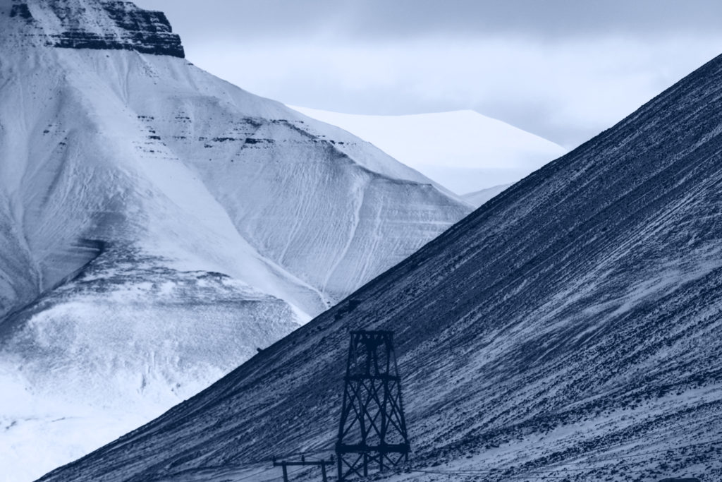
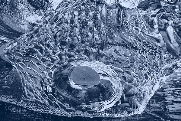
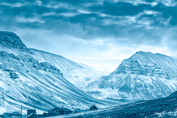
My goal is to complete 20 images for an April show in Longyearbyen. In order to determine what images I want to print I spent December testing different photographs to get an idea of how they would look as cyanotypes. I’ve inserted a few of the images I intend to use here, and you may think they look just fine in this version of blue, so why go to all that trouble to create a cyanotype when Photoshop will make such a good facsimile?
 The same reason I travel to the arctic to paint. The materiality of landscape informs my vision and my choices. The work done in the north has an immediacy and freshness that my studio work does not. The studio work is more studied, more polished. But I look at the gouaches I did in Iceland, the graphite work done in Longyearbyen, and I can feel the air and the silence and the mountains around me. It’s the same for cyanotypes. The printed work has an impact that the Photoshopped images, beautiful though they may be, do not.
Long ago, when I was a successful digital artist and Photoshop was the air I breathed I had a sig line that read: Give me enough RAM, and I will repaint the world. Now, I long for my own dark room and light box so I can remake the world in blue.